LinkedIn Company Header Photo Optimization Desktop & Mobile
Optimize Your LinkedIn Company Header Photo Banner
A LinkedIn Company Header Photo is one of the first things visitors see when they land on your company’s profile. It serves as a digital avatar for your brand, projecting its personality, principles, and professionalism. Bid farewell to the days of hiring managers rejecting resumes based on social media, and welcome to the future where optimizing this header can build credibility, attract jobseekers, and translate into better career opportunities in the long run. A good header photo gives off the feeling of a well-tailored suit.
As such, in this article, we’re going to cover, the function of a LinkedIn Company Header Photo; Types of Company Header Photos, Optimization strategies, and Common mistakes to avoid. Plus, we’ll share expert tips, what tools are worth having, and how the LinkedIn Golden Rectangle can be used for maximum visual impact.
What is a LinkedIn Company Header Photo?
A LinkedIn Company Header Photo is the big banner that appears at the top of a LinkedIn company page. It becomes a branding resource that allows the business to promote its culture, services, and mission. A tech startup, for example, might adopt a sleek, modern design, whereas a nonprofit may want to showcase an impactful cause-related image. A properly optimized header photo gives great credibility and establishes a good business identity.
Different Types of LinkedIn Company Header Photos
- Branding Image
- Team Showcase
- Product Spotlight
- Event Promotion
- Enlightened Success
Branding Image
Branding Image has a clean and professional, logo-based banner that reinforces brand identity. Keep extra wide text to a minimum, with a clear high-res quality background. This method is effective for companies with an established place in the market and a strong brand identity. Use this as your template, and make sure everything is spaced correctly and lined up to look official.
Team Showcase
A high-resolution team photo that displays your company’s workforce. This kind of builds trust and makes your business human. Employees should wear business attire, a neat background, and since you will be recording audio, make sure there is as little background noise as possible. Great for businesses that want to highlight company culture.
Product Spotlight
This is a banner with your best-selling product or service to draw customers in. The design needs to be attractive and have a strong call to action. That works well for companies that sell physical or digital products. Alternatively, use colors that contrast each other to enhance visibility.
Event Promotion
A promotional header for upcoming company events, like conferences or product launches. As you write your event details, make it clear but not overwhelming. The headline must be periodically updated to keep it current. This type makes sure your LinkedIn page is always fresh and interesting.
Enlightened Success
Custom logos and professional branding. This can be in the form of patterns, gradients, or artistic elements that go with your company’s theme. It also serves creative industries and startups well. The important thing is to stay fresh and clean.
How to Optimize Your LinkedIn Company Banner Photo
A LinkedIn Company Banner Photo should be bright, engaging, and correctly proportioned for various screen views. Use high-quality images and avoid clutter. Doing it professionally can be of great impact. Make sure the design does not break on mobile and desktop. Anything important (text or logos) should be centered, so nothing gets cut off. A minimalistic design with strong branding colors ensures higher visibility and a unique presence.
LinkedIn Company Header Photo Background Size Step by Step Guide
So now, here is a simple step by step guide to the ultimate Company Header Photo Background Size.
10 Tools for Creating a Professional LinkedIn Company Banner Image
Canva
An easy-to-use graphic design platform with templates (including some specifically for LinkedIn headers) Its drag-and-drop interface allows easy customization, even for people without design background. You can use Canva’s enormous element library (including images, icons, and fonts) to create tailored banners.
It has collaboration features as well, which allow teams to get together on design in real time. And not only does Canva offer a free plan that has plenty of features for basic needs, but they also offer premium features for a subscription.
Adobe Photoshop
Adobe Photoshop is the go-to program for professional photo editing, offering powerful tools for complex designs. Photoshop gives you complete control over every aspect of your banner from precise editing capabilities. You can play with the layers, use advanced filters, and piece together your design for a crisp, high-quality result.
It has complete support for all file formats and full integration with other Adobe Creative Cloud apps. The standard for making unique, highly detailed headers, this is the best choice for users with design experience.
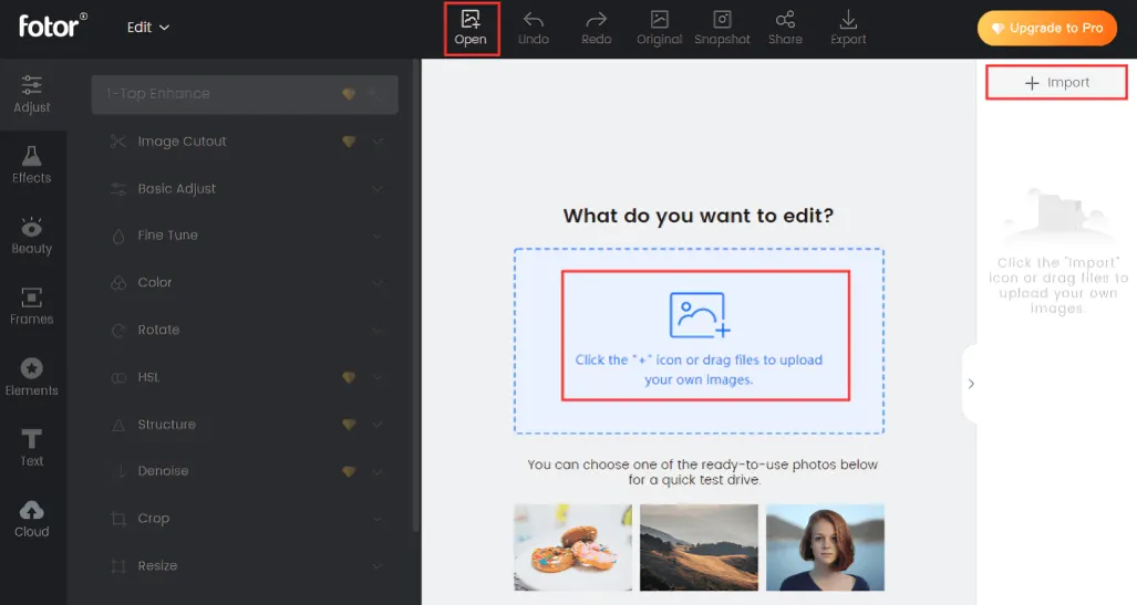
Fotor
Fotor provides a simple and user-friendly graphic design online tool that can create LinkedIn banners easily. This site has a lot of different prepared templates, especially for modern and clean looking templates. Fotor offers core editing functionalities including background removal, text overlays and photo enhancement, great for quick, attention-grabbing designs.
The premium tier of the platform provides access to more advanced tools, yet the free version is still very powerful. Best for users looking for quick results without compromising on design quality.
Piktochart
Piktochart is best for transforming technical data into stunning charts so it’s a great option if your LinkedIn header will include a story or data. It provides templates for the banner involving charts, infographics, and data visualization elements. With its user-friendly interface, Piktochart allows you to drag and drop data directly into your designs, making it a great tool for businesses that want to showcase key metrics.
It also offers tools to create custom color schemes and font pairings, which will show you what to use for a consistent brand aesthetic.
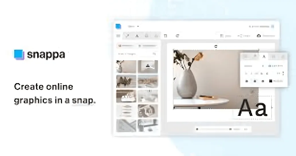
Snappa
Snappa is a simple but powerful tool to create graphics for social media such as LinkedIn banners. Pre-sized templates to fit LinkedIn’s dimensions and be sure your design’s the right size. With a simple drag-and-drop editor and a library of stock photos, icons, and fonts, Snappa can help users create professional-looking banners in just a few clicks.
Users are also able to upload their own images and logos to further customize their design. Snappa’s free plan comes with lots of functionality, but paid tiers get you tons of extras in the way of templates and design items.
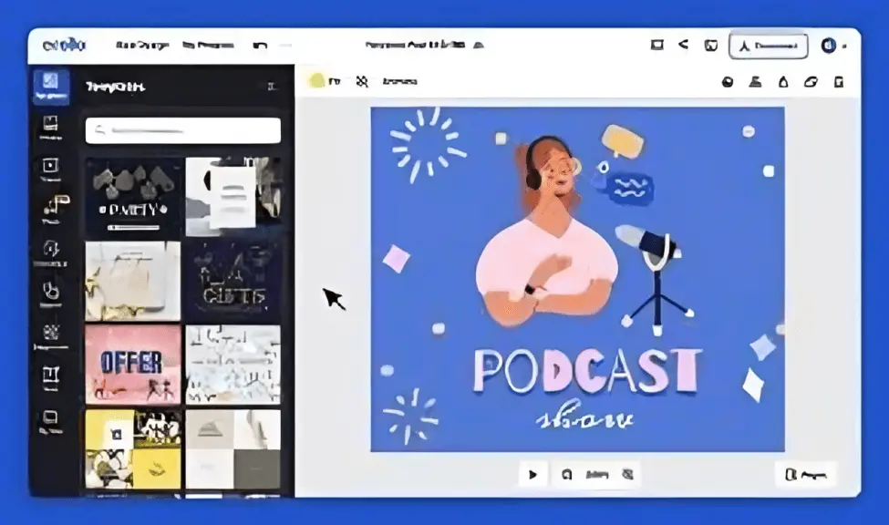
Crello
Crello is another design tool like Canva but it’s more modern and offer similar templates | animation options, so, it’s also great for creating dynamic LinkedIn headers. Crello has thousands of templates, which makes it easy to create eye-catching graphics for your banners. This tool lets users bring elements to life, adding animation to designs great for a more dynamic visual experience.
Crello includes background removal and custom asset uploading functionalities along with other pro editing features. A handy tool to design animated or static LinkedIn headers.
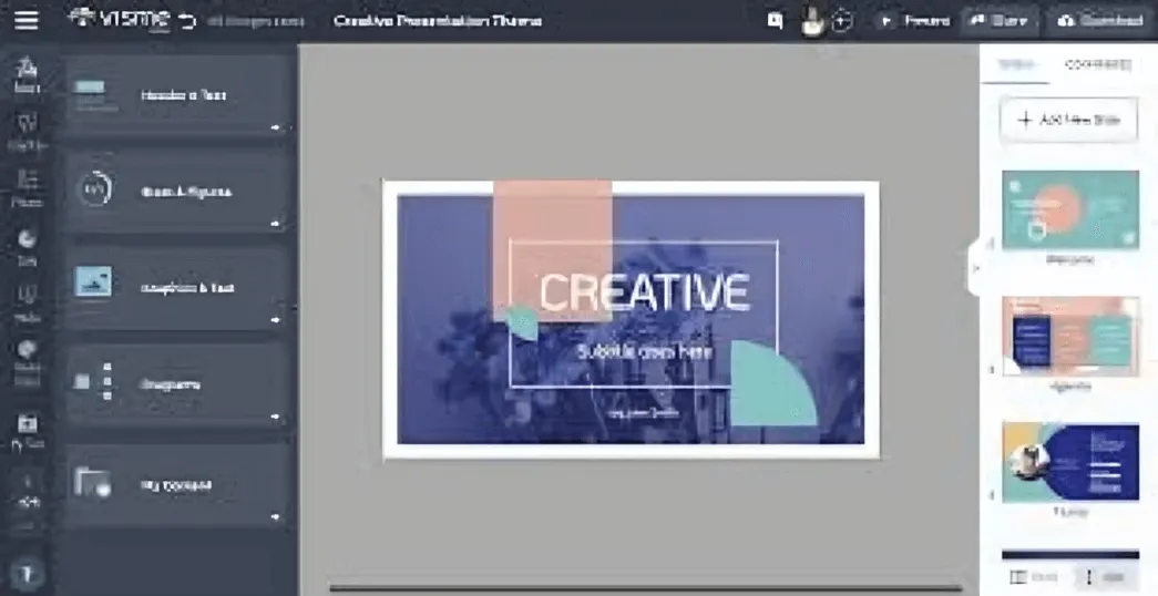
Visme
Visme is an all-in-one design platform with an emphasis on creating data-driven and professional visuals, from infographics to presentations and LinkedIn banners. Its standout feature is the complex integration of charts, graphs, and interactivity in designs. With Visme, you can make beautiful visuals to present only the important data and complement your brand personality.
It provides customization options so that you can match the color scheme, font, branding elements, etc., to allow consistency across your LinkedIn account. It’s perfect for companies preparing to deliver both style and substance in their headers.
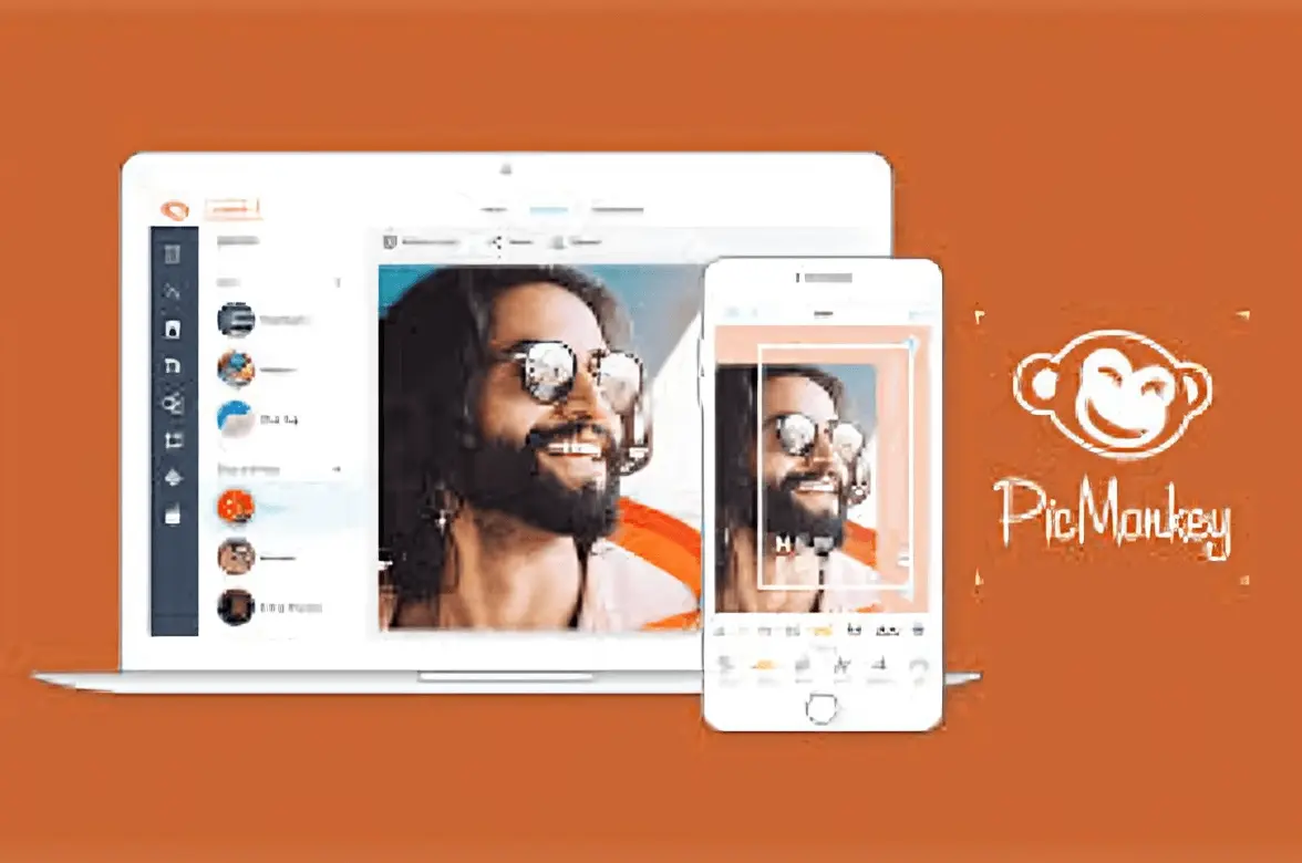
PicMonkey
PicMonkey is a creative design tool that is great for anyone looking to easily create professional-looking LinkedIn banners. With retouching tools, photo effects, and templates, it helps turn plain designs into professional-looking graphics. PicMonkey also offers text-editing tools that allow you to play with fonts, color overlays and positioning for maximum effect.
Its intuitive drag-and-drop interface makes it easy for users of all levels of skill. The platform’s paid options unlock more advanced editing tools, making it a versatile solution for more complex designs.
Stencil
Stencil is a social media-specific online design tool with templates already optimized for LinkedIn and other platforms. Boasting a huge library of stock images, icons, and fonts, it makes creating stunning visuals quick and easy. Stencil is really easy to use, enabling users to create banner designs within minutes.
It also includes a brand kit feature that keeps your designs consistent by automatically applying your brand colors with your logo. It’s perfect for people wanting speed and simplicity without sacrificing quality.
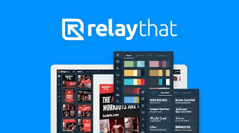
RelayThat
RelayThat is a design automation tool that can also be a great help in creating your brand-aligned LinkedIn banners. This feature leverages artificial intelligence to auto-generate designs that fit your brand guidelines, ensuring that all things colors, fonts, logos, etc. remain consistent across your visuals.
RelayThat has LinkedIn templates with proper sizes and can generate multiple iterations of a design in a matter of seconds as well, which makes it the best tool for testing the different look and feel. Great for companies that want to take their marketing efforts to the next level while keeping a business-styled presence on LinkedIn.
Tips for Selecting a Great LinkedIn Company Header Banner Image
Ensure it Fits with Your Brand Identity
- Pick an image that is aligned with your brand colors, style, values, etc.
- And it should immediately communicate who you are and what you do.
- We build trust and recognition through a consistent visual identity.
Keep It Clean and Uncluttered
- Stay away from images that are overly busy and itinerant of your company name.
- Clean, effective visuals give you a great first impression.
- The negative space helps to make your logo and tagline pop.
Use High-Resolution Images
- Unprofessional, low-resolution, blurry or pixelated images lead to a loss of credibility.
- Regardless, ensure that the photo is a minimum of 1584 x 396 pixels in size for clarity.
- Review its visibility on varied devices before confirming.
Show Your Company Culture
- Show off actual team members, office spaces, or company events.
- Genuine photographs create trust and make your brand more authentic.
- Stay away from stock photos that are generic and don’t reflect your company.
Showcase Your Differentiator
- To illustrate your uniqueness, use visual assets that show it.
- If it’s innovation, sustainability, expertise whatever it’s, make sure that’s clear.
- A powerful visual can emphasize your brand mission and values.
Keep Text Minimal and Readable
- If you are adding text, make it short and in a legible font.
- But don’t fill the picture with long slogans or so much detail that the viewer can’t take it in.
- Check readability (desktop and mobile screen)
- So you go ahead to search on Google and find the closest A list celebrity with a matching profile picture to yours.
Match It with Your Profile Picture
- Be sure that your logo and header photo work well together.
- Having a coordinated look makes your profile photo attractive.
- Use a unified color palette for a more polished look.
Consider Seasonal or Campaign-Based Updates
- Changing your header photo for holidays or seasons gives a fresh feel.
- Use it for announcing product launches, wins, or company milestones.
- Just ensure those updates remain in line with your branding.
- This is all about testing different versions of something to see which one gets the most engagement.
Test Different Versions for Engagement
- Consider conducting A/B tests with different photos to gauge which has a stronger response.
- LinkedIn engagement can be measured through analytics on profile visits and engagement levels.
- Tweak what works best for your audience.
- Be Professional but Personable
- Stay away from controversial, low-quality or too-casual photos/images.
- Be professional yet friendly; it makes for the right “connections.”
- Your header is your digital storefront make it irresistible!
How to Avoid LinkedIn Company Header Picture Mistakes and Fix Them
Having a company header photo designed correctly can help build your brand identity, however, many companies make common mistakes that destroy their professional image. Here are common mistakes to avoid and actionable tips to help you improve.
| Error | Problem | Solution |
| Using a low-res image | Nothing makes your company look unprofessional instantly like a blurry or pixelated header photo. It can also create an impression that your brand lacks attention to detail. A low-quality image can be a huge turn-off for potential clients, partners and jobseekers. | Upload a good high resolution image, with smart details and clear visibility. The ideal header photo dimensions fall in accordance with 1584 x 396 pixels for a LinkedIn company page. For a clean, professional appearance, make sure it has a minimum of 72 DPI (dots per inch). Before finalizing, zoom in to check for pix elation, and preview it on different screens |
| Not Focusing on Mobile Optimization | Not many firms take into consideration how their LinkedIn header image appears on mobile most created exclusively for desktop view. Since a significant part of LinkedIn users are accessing it on phones, a cropped or distorted image can damage your brand presentation. | Check how your header photo appears on the desktop and mobile versions before you hit the publish button. Avoid text, logos and key visuals being cropped by keeping them centered within the safe area. As a rule of thumb, keep the main element of your design in the center 1230 x 200 pixels, because LinkedIn will scale the image based on screens. |
| Complicated [Over Designed] Design | Overcrowded header photos can appear cluttered and distracting. A confusion rather than clarity between excessive text, multiple fonts, or too many visual elements. A busy design may distract from your logo and company name, as well. | Solid header designs with balance. Select one or two main colors that fit with your brand and limit gradients or patterns. Add text if you do, and only brief under 10 words, ideally and clear, bold font for legibility. White space (or negative space) is your friend, it makes important things pop. |
| Relying On Average Stock Photos | Using generic stock images such as cliché office settings, handshakes or abstract corporate imagery, tends to give your profile a lack of personality and originality. A generic, clichéd stock photo, however, does nothing to express your company’s unique identity | Instead of generic stock images, use a bespoke design tailored to your company’s mission, culture, or products. Consider using: Authentic images of your team to personify your brand. A photo of your office or working space for legitimacy. Quick view: Some kind of image that summarizes your core services creatively. Your company tagline is tastefully integrated into the design. If you need stock photos, go for high-quality, less common images that represent your brand’s voice. Also, you can apply a custom filter or overlay to make them look different. |
| Not Regularly Updating the Image | An old header photo may cause your company to appear inactive or inactive. If you are still showing a past event banner, an outdated logo, or a seasonal campaign well after its end, visitors may wonder if your profile is regularly maintained. | Update your LinkedIn header photo at least once per year or when there is a significant company event. Good times to update include: Rebrand (new logos, colors or tag lines). A key company milestone (anniversary, awards, or expansion). A seasonal campaign (holiday promotions, recruitment drives, or product launches) So if you need new creative but want to be consistent, you would do well to build yourself a template and just switch out the images or other bits of text while keeping to the base design. |
How You Can Use The LinkedIn Golden Rectangle
The LinkedIn Golden Rectangle helps keep balance and aesthetics. It ensures crucial design elements fit comfortably within the frame. Sticking to this concept can make sure that your header photo has a well-designed and organized appearance.【8†source】 Align your layout using the grid tools in your design software.
Why is a LinkedIn Company Header Picture Valuable?
An optimized LinkedIn Company Header Photo builds your brand’s trust. Fully opening its doors to a more targeted audience is an essential part of attracting the right audience — whether a jobseeker, client, or industry peer. A visually attractive header photo also attracts people to your company page. Ensure that you use the same handle on your social profiles as this helps build recognition and credibility. Additionally, it acts as a great marketing tool with no additional advertising costs.
FAQs
Conclusion
LinkedIn company header Picture is more than a decorative element, they define your brand identity. Similarly to decluttering your workspace, refreshing your header and making sure it’s relevant will help to make your company profile more inviting! In the digital landscape, the first impressions are made online, and a strong header gives visitors the right idea about your business.
It’s also great for enhancing your credibility as a visual statement of your values and purpose. Therefore, spending time optimizing your Header photo is a minor but mighty step in establishing strong branding.
Further, consider your LinkedIn header like a digital business card one that introduces you even before someone opens something you wrote. It needs to grow with your company, capturing accomplishments and transitions. An interactive, updated header also helps remind visitors of your brand, similar to how personal goals update and help us focus as humans.
So, when you have a moment today, check in on your LinkedIn header and make sure it reflects your brand message as it stands now.
![Mastering Format Text in LinkedIn Post : Bold, Italics & More [+ Free Tool]](https://litextformatter.com/wp-content/uploads/2025/03/Feature-Post-2-768x434.webp)